Sarah Richardson Redesigns A London Flat
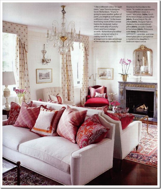
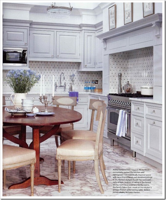
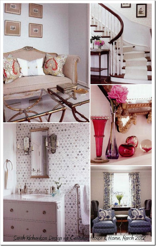
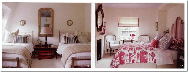
I remember Sarah Richardson sharing Facebook updates of her travels to London last summer/fall, so needless to say, I was intrigued when I saw “London Calling!” on the cover of the March 2012 issue Canadian House & Home magazine. This London flat gets a complete overhaul by the team, and the ‘after’ is nothing short of stunning. Overall, the design style is much too regal for me, but there are elements that I love.
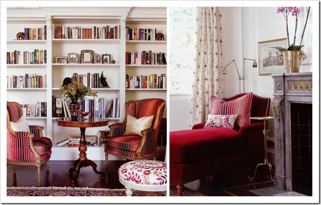
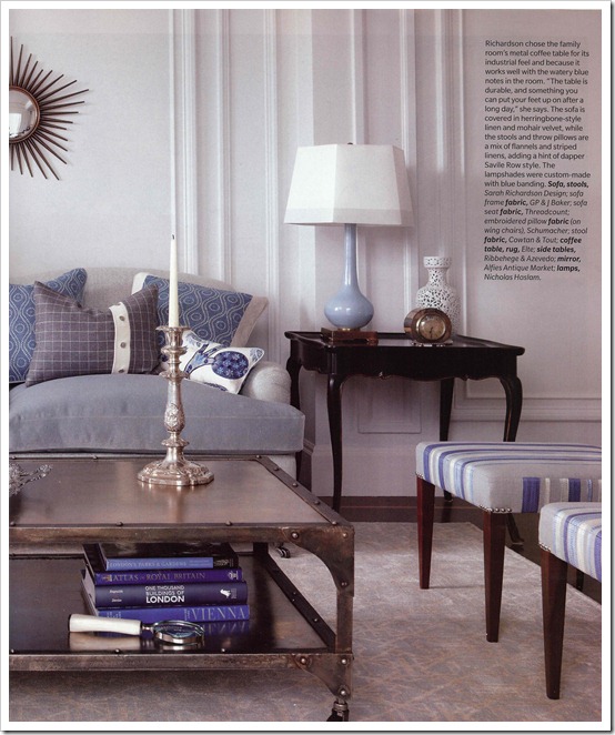
Pretty, isn’t it? Of my favourite elements; I love the living room colour palette just as much as I love the watery blue with grey in the family room – the family room is too formal for my liking but I like calmness of the space (minus the coffee table).
The entire March issue of Canadian House & Home is dedicated to colour, so pick one up if you can – it’s a great collection colour inspired interiors.


Comments
www.chattafabulous.blogspot.com
good points!Thanks for your share!
For more information about studio apartment london visit this website http://littlelets.net/greater-london/properties